Curvedsphere

Why Responsive Design is Essential for Your Online Store

A responsive design is the backbone of a successful e-commerce website. Given the scenario of today’s digital age, where consumers switch between desktops, tablets, and smartphones so effortlessly, having a website that can adapt to different screen sizes cannot be treated as a luxury but has become a necessity. 

A responsive design will ensure that your online store not only looks great but works perfectly across all devices to provide a seamless and enjoyable shopping experience for your customers. 

Let’s talk about responsive e-commerce design and how it may provide you with a much greater potential impact on your online sales and consumer satisfaction.  

We as the best eCommerce web development company in USA, in this blog are going to unravel the mysteries of building a responsive e-commerce website that captivates your audience and increases your bottom line. 

What is Responsive Design? 

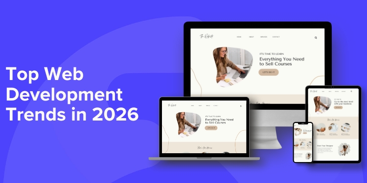
Responsive design allows websites to automatically adjust according to many window sizes and resolutions so that they can be accessed easily from the smallest desktops to laptops, tablets, and large-screen mobile phones.  

They use flexible grids, flexible layouts, responsive images, and CSS media queries, where changes in the appearance and functioning of the website are done according to the type of device being used. 

Responsive design enables a site’s content to be resized, reordered, and served with images in ways that adapt to screen size. This automatically eliminates the need for separate mobile and desktop versions of a website, thereby making it easier to develop and maintain. Responsive design also makes accessibility on websites more accessible since the content is more readable and navigable on smaller screens. 

Overall, responsive design allows the reach to a greater population, increases user satisfaction, and boosts their presence on the web in general. 

Benefits of Responsive Design for Your E-commerce Website 

Responsive design has become a must-have for any e-commerce website today. It adjusts your content to fit any screen and ensures the experience of your site is optimal on every device. So, here are some key benefits of responsive design for your e-commerce website: 

Easy Navigation 

Responsive design allows for easy navigation on your e-commerce site, depending on the size of the screen or desktop, tablet, or smartphone you use; thus, no need to zoom, scroll, or pinch around to ensure easy and intuitive usage with constant elements of navigation. Hence visitors can find the information as needed with easy purchasing and browsing for their needs. 

Optimal Layout 

Responsive design makes sure that your e-commerce website adapts to the various screen sizes, from desktops to smartphone displays. This adjusts the layout, making it more optimized in terms of how a user experiences the website. Adjusted layout improves readability and navigation besides making the products easily accessible by customers. Responsive design by adopting the mobile-first strategy ensures your site works well on all screen types where a better percentage of online shopping takes place. This will create a larger client base, coupled with enhanced conversion rates, so your business is sure to grow. 

Faster Load Times 

Responsive design ensures that your e-commerce website adjusts to different screen sizes and devices making it viewable across every type of device available. Furthermore, the faster sites are ranked positively by the search engines. This might translate to more visitors to your website through organic searches. Finally, a fast, responsive e-commerce website means higher conversion rates and sales. 

Enhanced Mobile Shopping 

Responsive design makes your e-commerce site perfectly compatible with different screen sizes, such as mobile devices. That makes the customer’s shopping experience friendlier when he is on the small screen. He can easily find stuff on your site and will not get frustrated while trying to navigate or make some purchases. This increases mobile traffic, and conversion rates, and also boosts sales. But with responsive design, your search engine ranking also improves because search engines prefer those sites that are friendly to mobile devices. A wider range is more likely to increase the number of customers who will click on your online store; hence, it acts as a booster for business growth. 

Improved Conversion Rates 

Responsive design is important for a seamless transition on different devices and monitors sizes. Users can get the same and optimized shopping experience. This will also improve conversion because users can easily navigate the website and search for and purchase a product using multiple devices. A responsive design cuts down the bounce rate, increases user engagement, and most importantly, yields better sales as it caters to a broader audience and also enables frictionless shopping across all channels. 

Consistent Indexing 

The key benefit of responsive design is that it ensures uniform indexing on all possible devices; although this substantially increases the visibility of your e-commerce site in search engine results. Google and other search engines would desire to rank websites with great user experience regardless of a specific screen size. Responsive design allows search engines to easily crawl and index your content; hence improving ranking. Consistent indexing will get your website to reach more audiences, drive more organic traffic, and therefore boost sales. 

Reduced Development Costs 

Responsive design drastically reduces the development cost of an e-commerce website because it does not require a need to develop multiple websites, each dedicated to a particular device. One adaptive website can be designed and automatically adjusts itself to the various sizes of screens, whether desktop or smartphone. It leads to a unified approach, saving much time and reducing resources for multiple designs and coding efforts. Also, it is very easy to maintain and update as changes only need to be reflected in one codebase instead of several thus saving time and money in the long haul. 

Simplified Maintenance 

Responsive design ensures easy maintenance of a single adaptable codebase that self-adjusts to different screens. Again, responsive design often comes with enhanced performance, decreasing the time taken to upload, thus improving user experience. This indirectly simplifies a maintenance task on performance optimization. 

Unified Brand Image 

Responsive design will see an overall brand image on all devices, be it a desktop or smartphone. It automatically adjusts its layout and content into different screens and thus eliminates the need for separate mobile and desktop websites. This strengthens branding knowledge in the customer’s minds since they always see a consistent view and feel regardless of the device being used. Such a brand image will thus generate trust and credibility and generally result in better customer experience and higher conversion. 

Key Elements of Mobile Responsive Design in E-commerce 

Fluid Grid Layout: The flexible grid system accommodates the dimensions of different screens. It ensures that there is always the best content arrangement on other devices. 

Responsive Images: Automatically resizes images with the quality set to the capability of the screen to upload on the webpage. Thereby improving the page loading speed. 

Touch-Optimized Elements: Interactive elements, including buttons and links, are easy on the touch screen. Thus, leading to intuitive use and impeccable user experience. 

Fast Page Loading: Optimized images, reduced code, and efficient server setups deliver fast loads even on slower connections. 

Streamlined Checkout: A checkout process that is mobile-friendly-by-design. When done properly, it can help reduce friction and increase conversions. 

Continuous Testing: The Website Continuously tests different configurations for various devices and sizes of screens by digging out bugs on those sites. 

How to Implement Responsive Design for Your E-Commerce Website 

Here are the key steps to implement responsive design for your e-commerce website:

1. Choose a Responsive Framework or Template:

Implementing responsive design frameworks or templates would be great for your e-commerce website. Pre-built frameworks and templates have a solid base and pre-designed components that can automatically adjust to different screen sizes. Some examples of these are Bootstrap, Foundation, and Materialize, which offer grid systems, pre-styled components, and media queries to handle layout adjustments. Lastly, you may use pre-crafted responsive themes for more popular e-commerce platforms like WooCommerce, Shopify, and Magento. These are specifically crafted for e-commerce sites, and they usually include mobile navigation, product carousels, and optimized checkout processes. Using a framework or template will dramatically quicken development while also providing a seamless, responsive design across devices.

2. Use CSS Media Queries:

Another way to apply responsive design for an online store utilizing CSS media queries is by specifying some styles for some screen sizes. You can target different devices and apply some styles with the help of the @media rules. You can hence change the font sizes, layout, and images to work perfectly when their smaller screens have been accessed. You can even make the navigation menu easier to use on mobile devices. Media queries should be drafted carefully for a website to fit smoothly across different screen resolutions. So you can guarantee optimal user experience across all devices. 

3. Implement a Fluid Grid Layout:

Use CSS to define a grid system that adapts to different screen sizes. Start by creating a container element that will hold your content. Inside the container, use a CSS grid or flexbox to arrange the content into rows and columns. Use relative units such as percentages or em units for widths and margins to enable dynamic adjustment of the layout. Consider using a CSS framework such as Bootstrap or Foundation for its ready-made grid systems. Using fluid grids ensures that your website translates well to any device, thus ensuring ease of use by users and increasing chances of conversion. 

4. Optimize Images:

All this is only possible unless you compress images first to reduce their file size but not lose any quality in that. Use the proper format for image; the photographs can be in JPEG while graphics with transparency can go for PNG. Use responsive images by having multiple versions of each image at different resolutions with the aid of srcset and size attributes on your HTML code. Such attributes allow the browser to determine which image is the best to download according to screen size and pixel density. Consider using lazy loading so that images will only start to be loaded right before they are about to be presented to further improve the initial page load times. 

5. Test Across Devices:

For responsive design to be implemented in your e-commerce website, use a responsive framework such as Bootstrap or Foundation to create a flexible layout. Ensure all the content, images, etc. on the website are optimized for different screen sizes. Inspect your website carefully on various devices and screen resolutions to find faults in layout or functionality. A second method is to make use of browser developer tools to simulate screen size. Then you may redesign your website for these different dimensions. You should test your website regularly to ensure that it’s pretty much working well on all of the devices. 

Conclusion 

Responsive design is no longer a luxury but a necessity for any successful e-commerce business. Therefore, by giving priority to a seamless user experience across all devices, you can consider building up your online sales, enhancing your brand reputation, and staying ahead in the game.  

This way, your customers can access your products and services easily irrespective of their devices.  

Responsive design is one investment no e-commerce business should forgo. They can significantly become the backbone of your online success, especially by giving top priority to having a seamless user experience and search engine optimization while saving resources.  

To avail the best Web Development Company Dallas TX, look no further than us. 

Get to know our service better by reaching us at +1 (215) 859-1390 or hello@curvedsphere.com! 

Which tool is better for web development?

In the bustling world of web development, where innovation is the cornerstone and creativity are the driving force, having the right tools at your disposal can make all the difference. 

A great arsenal of tools has the power to smooth out workflows, increase productivity, and naturally lead you to perform above par. 

The most important thing is to be ahead of the curve all the time. We stand proud to be the best web development company Dallas TX as we use top-notch tools for web development. A well-calibrated set of tools will be able to give the shape it needs in your web development projects. 

Let’s dive into the 10 best tools in web development in 2024. These are built to boost the productivity level without comprising code quality. It ensures excellent quality delivery in digital solutions.  

So, let’s begin and discover how these tools can make your web development game stronger! 

10 Essential Tools for Web Development 

Visual Studio Code (VS Code) 

One of the best web development tools is Visual Studio Code or VS Code. It is lightweight and fast, has an extension library as comprehensive as any user could need, also natively supports Git. It provides intelligent code completions with IntelliSense, robust debugging, and an extremely customizable interface. VS Code extends beyond to cover more platforms, comes with a built-in terminal, and has Live Share where multiple developers can collectively develop real-time ideas.  

Webpack 

Webpack is one of the most powerful tools with which the developers changed the way of development for the web. It bundles and manages JavaScript modules, CSS styles, as well as all other assets efficiently in terms of file size minimization, reducing HTTP requests, etc. Modular approach related to usage in Webpack allows its users to code in a much more organized manner while enabling reusability, thus simplifying maintenance and scaling complex projects. Finally, it’s Webpack’s flexibility as well as performance enhancements due to its modularity that makes it truly an invaluable tool for modern tasks in web development. 

Node.js 

Node.js is quite efficient in developing real-time applications and APIs, which becomes possible because of its event-driven, non-blocking I/O architecture. It can process several requests without blocking the main thread. This is a primary reason why Node.js has become so trendy with all its numerous libraries and frameworks such as Express.js and Socket.io. It eases the process of development and brings about immense functionality together. Finally, a single-language environment in Node.js facilitates the development process and reusability of codes. 

React.js 

React.js is a powerful and versatile tool in web development. It provides a particular model of a component-based architecture to render complicated user interfaces to be built and maintained efficiently. Besides this, its promising idea of reusability in the concept of building blocks across a set of encapsulated structure and behavior leads to better code organization and reusability. Another factor that favors React is that it has a large and active community, which provides rich resources, libraries, and tools for development and addressing any problems. 

GitHub 

GitHub is a primary tool for web development; one drives everything into one place. Hence integrates any collaborative interchange with versioning and high code management. It has a system Git repository and tracks the change that allows developers to revert to earlier versions on simultaneous team collaboration on any project. Because it has a wide variety of features such as issue tracking, pull requests, and integration with the biggest development tools, GitHub helps streamline the whole process of development. 

Postman 

Postman is a leading tool in web development, aiming to ease the processes associated with API testing and development. It comes with a friendly interface that enables you to generate, send, and save a request. This makes it easy to test APIs and ensure that they are in proper working condition. Beyond that, Postman offers various features such as environment variables, collections, and automation that help developers conduct their API testing workflows efficiently and effectively. Developers will significantly improve on productivity and quality with the use of Postman in developing web applications. 

Sass 

Sass is one of the most popular CSS preprocessors, and it offers much more in terms of the Web development benefits. It expands possible applications with variables, nested rules, mixins, and functions, altogether making code even better organized, reusable, and maintainable. A natural fact, Sass compiles into standard CSS, so it will be read by every browser.  

ESLint 

ESLint is actually a mature and powerful linter for JavaScript. It allows developers to prevent poor code quality and enforce various quality standards by detecting problems with code and flagging them to be addressed. ESLint lets you know any potential errors or even style issues and code by automatically identifying such potential and reporting it in each code. It keeps the code clean, readable, and maintainable. It enhances the code’s quality by enforcing coding standards and best practices, thus reducing bugs and making collaboration between team members easier. It also provides configurable rules and configurations in which one would opt to customize the linter according to their needs and preferences. 

jQuery 

jQuery is highly flexible with simplicity and cross-browser compatibility, making it an extremely useful tool for web development. Concise syntax achieves complex DOM manipulation, event handling, and AJAX requests. It has a huge ecosystem of plugins that further extend the functionality of jQuery, so it is truly able to cover and meet the kinds of needs that arise in web development. Its popularity means that there is a massive community with loads of resources for learning support. But even newer frameworks came into life, while jQuery remains reliably in place in numerous web-projects-simply because of the already proven track record and solid groundwork it managed to build up. 

Atom 

Atom is an open-source, highly customizable text editor very versatile for web development. While the number of features in its interface is pretty significant, its package ecosystem is way more than the huge packages available. Some other inbuilt features include multiple panes, a file system explorer, and whatnot. Due to flexibility, it allows users to change the editor according to their specific workflow and the community-driven nature ensures that it is constantly being updated and improved. With Atom, you can build a powerful environment for creating websites and web applications and make front-end or back-end development easier. 

Conclusion 

Choosing the best tool for your web development project depends on a variety of factors, including your specific needs, budget, and team’s expertise. Each business has its unique fit, but a starting point from which to start is essential. Here is hoping that this blog post has given you the insights to help you come to the right decision. 

If you are looking for an ecommerce web development company in USA, reach out to us. We have hands-on experience working with different tools and we can also give you a few recommendations and choose the best one that would work for your project.

On top of that, if you are looking for a marketing company Dallas that can support you in marketing your website, look no further than us. We will help you reach out to your audience and have more traffic flowing into your online store. 

To learn our service more, connect with us, call +1 (215) 859-1390 or hello@curvedsphere.com right away! 

What is the eCommerce web development process?

Introduction

In the thronging market of today, an online presence is no more a luxury-it’s an absolute necessity. For businesses aiming to tap into the vast potential of the digital world, an eCommerce website is the cornerstone.

Skilled developers and business owners join hands in the process of an e-commerce web development that takes an idea through to launch. It is a careful mixture of creativity and technical expertise, along with strategic planning.

A deeper understanding of the key stages of this process is what will help you not only make your eCommerce website visually attractive but also functionally smooth enough to provide a positive user experience.

Whether you’re just starting to build your empire or an established business looking to grow your presence online, dive into the dynamic world of eCommerce web development with us. Learn how to partner with a trustworthy e-commerce web development company dallas TX like Curved Sphere to lay up a digital storefront that will effectively drive sales and help lift your brand.

This blog post will take a closer look at the intricate process of eCommerce web development and guide you through the journey of turning your business idea into a thriving online store.

What is eCommerce web development?

E-commerce web development involves the process of developing online stores where businesses can easily sell their products or services directly to customers through the Internet. It means designing and building websites for online transaction capabilities by including a product catalog, shopping cart, secure payment gateway, and tracking of orders.

A reliable eCommerce web development company in USA is involved in developing custom online stores that have been fabricated to meet the particular needs of their clients. Most of the development companies operate in a multidisciplinary team that comprises talented developers, designers, and even marketing professionals who can develop a visually appealing website with a well-functioning site.

The eCommerce Web Development Process

E-commerce web development involves creating online stores that would help businesses sell their products or services over the Internet.

1. Planning and Strategy

Planning and Strategy form the very foundation of an eCommerce website development project. It involves exhaustive research, setting goals, and making strategic decisions. This is where businesses study their target market, conduct competitor analysis, and establish their value proposition. A comprehensive plan regarding what all a website would achieve with its objectives, features, and functionalities is prepared. The major points to be kept in mind are User Experience, website architecture, content strategy, and technology stack. This enables the growth and success of a business in the competitive world of eCommerce by laying proper ground with plans and strategies.

2. Design and User Experience (UX)

Design and user experience are crucial for e-commerce web development in building an online store that is both appealing and easy to use. The design needs to be done in such a way that it caters to just one smooth shopping experience for the customers. This involves wireframing and mockups to see the structure of the website, choosing colors and fonts, and designing intuitive navigation menus for the customer to interact with the website. UX designers also work to enhance the check-out processes to be as smooth, transparent, fast, and safe.

3. Development

The development stage is the actual construction of the e-commerce shop. In this stage, all of the design work is converted into code as the integration of all the requirements is carried out as product catalogs, shopping carts, payment gateways, and inventory management systems. The developers use programming languages such as HTML, CSS, JavaScript, and frameworks like React or Angular to construct the front end of the website to ensure it is appealing and user-friendly. Back-end development encompasses server-side functionalities: database management, product information storage, order processing, and integration with payment and shipping providers.

Quality assurance testing is another key milestone; the time to identify and fix bugs and errors before the final launch of the eCommerce website.

4. Content Creation

Content development is one of the most integral parts of building an eCommerce website. This is that stage where you have to generate and organize all words, pictures, and interactive features that will fill your online store. For example, that comprises product descriptions, category pages, blog posts, images, videos, and so forth. The better or best content works not only toward improving the experiences of users but also as a basic ground for content marketing and SEO. Create information-rich, interesting, and keyword-rich content that will raise the visibility of your website, creating more potential leads, backlinks, and of course, business.

5. Testing and Quality Assurance

In the development of e-commerce websites, testing, and quality assurance are highlighted as major stages when the site undergoes checks for appropriate functionality, usability, and quality.

QA teams use a diversity of testing mechanisms:

Functional testing, to make sure systems such as product search, checkout, and payment processing are working well;

Usability testing for ease of use, and ease of navigation;

Performance testing to understand how the website would react in terms of speed responsiveness; and

Security testing to find out the bugs and fix them through which hackers could compromise customer data.

That is achieved by testing and finding bugs at the very early stage of development and allows QA teams to ensure customer’s secure, reliable, and enjoyable online shopping experience.

6. Launch and Deployment

This is the final stage in eCommerce Web development. Now, your website will be introduced to the public. Testing is done before launching, and hence rigorous testing ensures the site is functioning correctly, and securely, and makes it easier for users. After tests are done, deployment follows on a live server, and visitors can start accessing it. This stage will also include key features like integrating payment gateways, shipping integrations, and marketing tools, making the website whole for business.

7. Maintenance and Updates

Maintenance and Updates are an important phase of any e-commerce web development. It consists of all the work that needs to be done after launching a website to keep it up, functional, secure, and updated. Security vulnerability fixation, performance improvement, and feature addition require regular updating. Bug fixing, performance optimization, and updating of content are the usual works in this stage. Furthermore, monitoring website analytics and user reception can help in identifying ways improvements can be made. This helps the website adapt and evolve with the changing needs of customers and market demands. An investment in ongoing updating will allow businesses to keep their website fresh and functional, ensure continued search engine ranking, and perpetuate sales.

Conclusion

It is an eCommerce website that works as a window for your products. This is the point from where the customer will get the very first idea about your brand. An ideal eCommerce web development process, skillfully executed, can make it an engaging one. Thus, the journey right from conceptualization to launch involves detailed planning, designing, and technicalities.

Remember that a successful eCommerce website is way more than just an online store; it is intended to be a dynamic driver of sales and brand loyalty.

The process, when done correctly, will produce an online venue that separates your business and feeds your growth.

To learn our service more, connect with us, call +1 (215) 859-1390 or hello@curvedsphere.com right away!